30 November 2013

Out of the Vaults: From Binko to Bluto

Omigosh... a Gerstein blogpost! They've been rarer than hen's teeth for quite awhile, and some of you know why—I've spent the last year stretched between quite a lot of publishing projects. But Ramapith updates couldn't stay extinct forever. After all, new research discoveries are still what I live for.
      And look for.

Just for instance—I've been looking for lost scenes. Thanks to the help of Tom Stathes, Mark Kausler, and others, I'm pleased to present here a rare Columbia Krazy Kat cartoon—The Katnips of 1940 (1934)—without original titles (sorry!) but with two musical numbers we don't usually see.
    The Busby Berkeley-like "Dance of the Girl With the Fan" seems to have made it past the Hays Code, but was dropped from the commonly seen TV print. So was "What a New Deal," celebrating (what else?) the New Deal and the end of Prohibition.


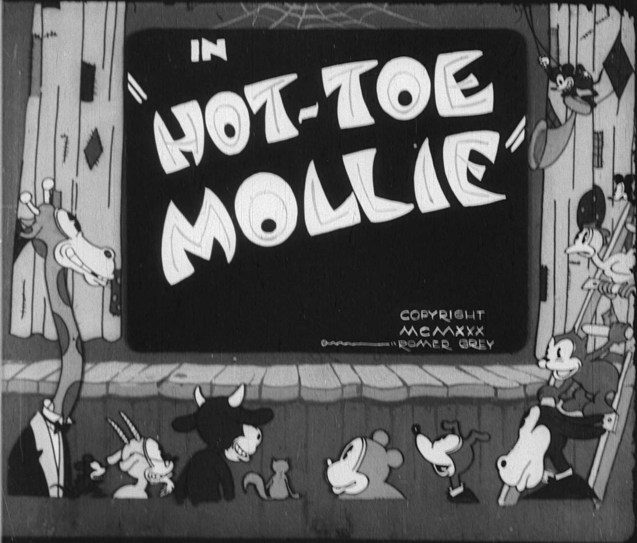
Moving on, let's see—I've been looking for lost films. The Romer Grey animation studio is almost unknown today; set up in 1930 by the son of Wild West novelist Zane Grey, it started work on four cartoons featuring the Mickeylike character Binko the Bear Cub. While Binko himself was a cheerful nonentity, Grey provided early employment for more than a dozen famous animators, including Bob McKimson, Tom McKimson, Preston Blair, Pete Burness, Jack Zander, Cal Dalton, and Riley Thomson. Many of these talents' very first animation was on Binko cartoons.
      The four films that went into production—Arabian Nightmare, Hot-Toe Mollie, Binko the Toreador and Sand Witches (all 1930-31)—are often described as never completed; Michael Mallory has referred to the first two as "ready to be duped."
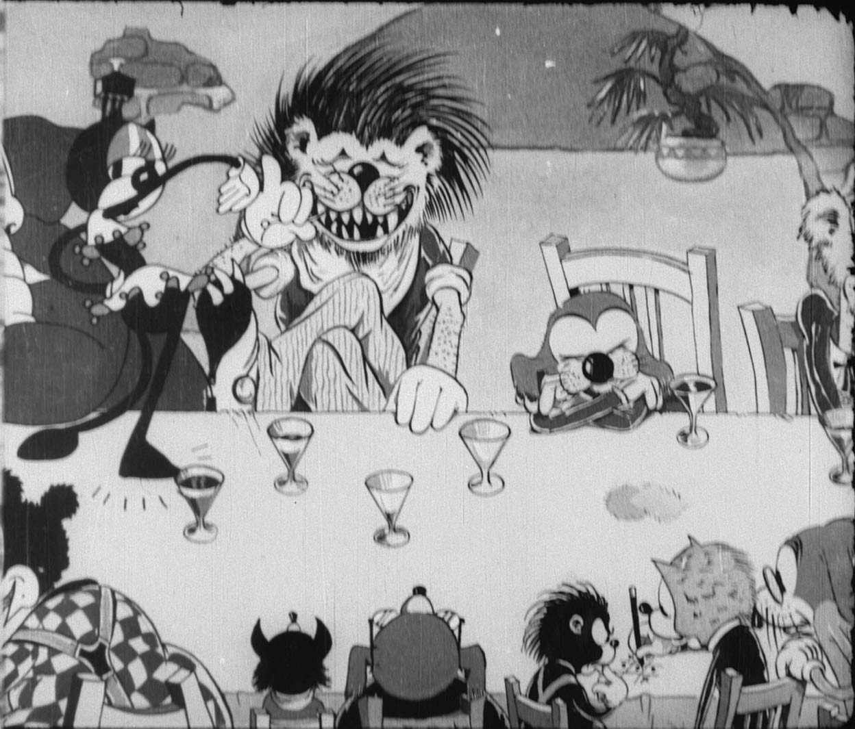
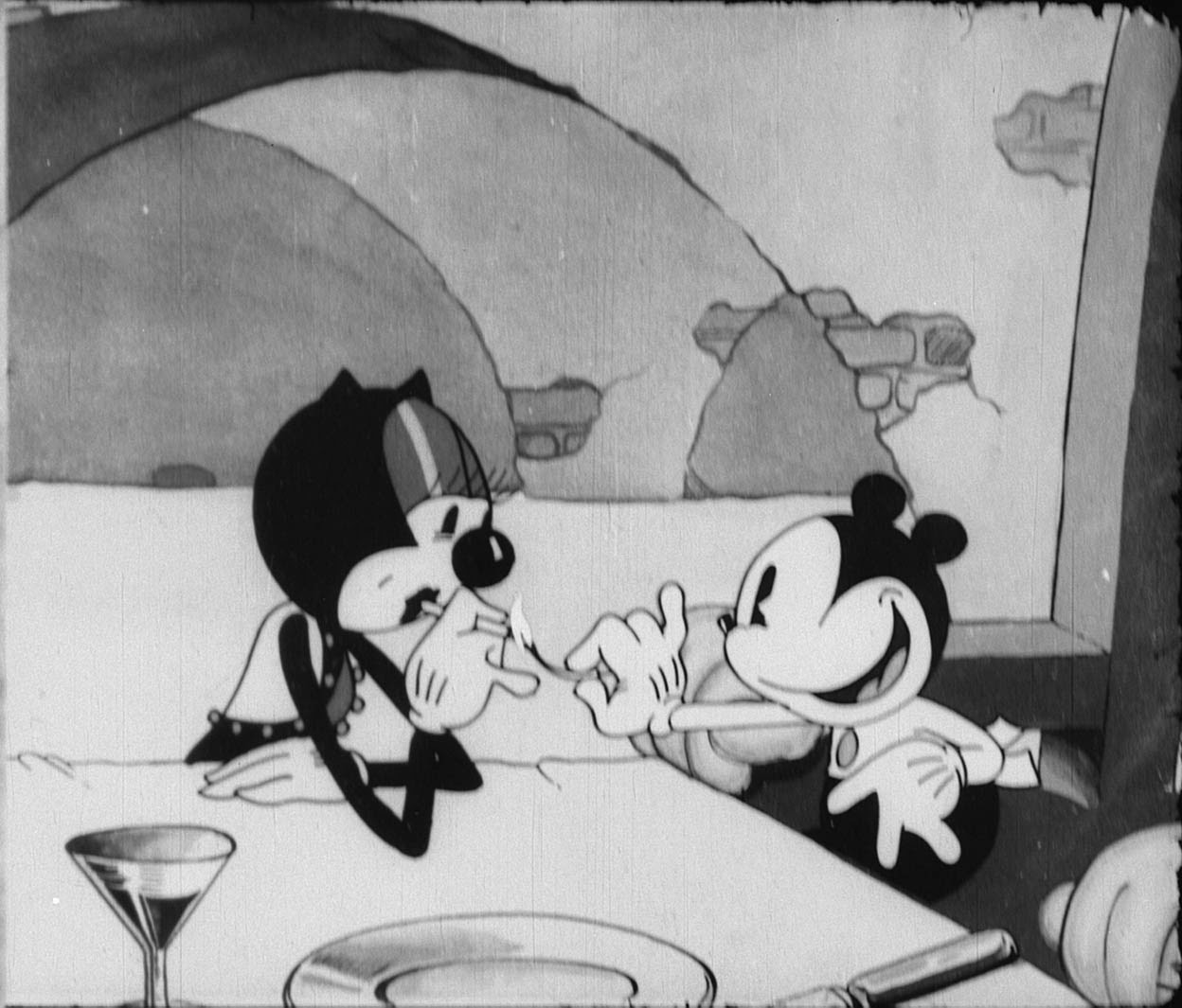
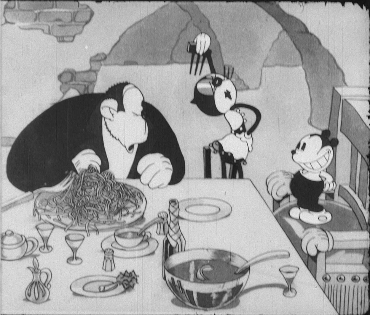
      I'm pleased to report that somehow, Hot-Toe Mollie made it past that stage; and not long ago I located a mostly complete print in a private collection. I don't have good quality footage yet, but here's your first glimpse of this long-lost Binko adventure:


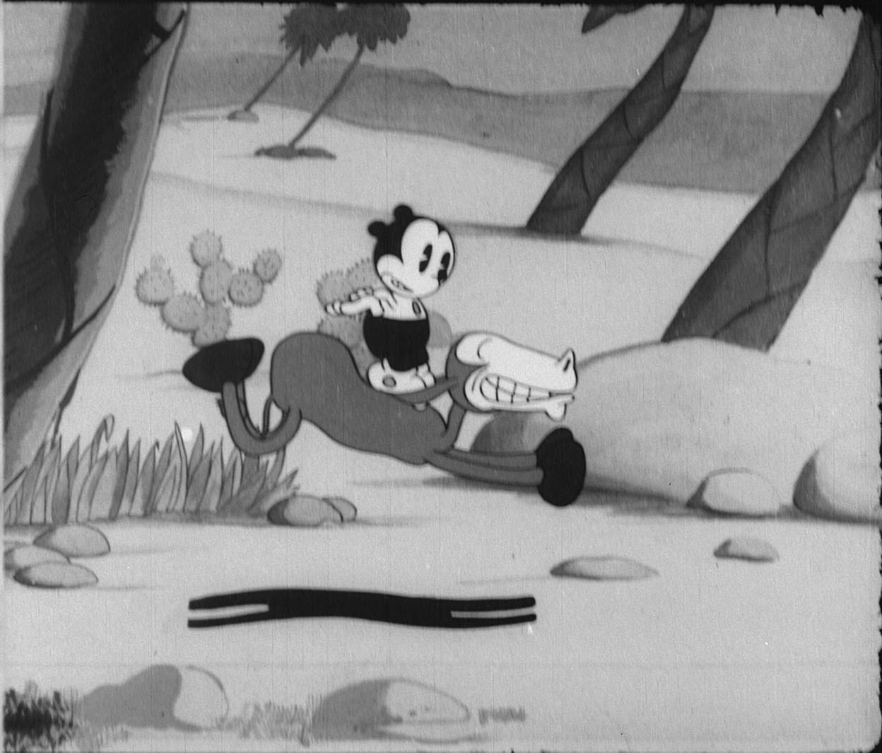
(From one obscure studio to another: animation of the galloping donkey [image 2] was reused in Boyd La Vero's Mexicali Lilly [1932], a Marty Monk cartoon. What was the connection? Animator Cal Dalton worked for both Grey and La Vero.)

Those of you near Michigan might get to see Hot-Toe Mollie in an hour! As of a last-minute decision, my friend and colleague Steve Stanchfield will be premiering our newly recovered element in "Out of the Inkwell, Out of the Vaults": a screening this afternoon at the Detroit Film Theatre. Mollie will be shown in the last third of the screening (likely around 3:45 PM), so if you're nearby, drop in! I promised to put up this post as a kind of program note.
      If you can't make it to Detroit immediately, don't worry—Mollie will appear before too long on an exciting DVD project. Keep your white-gloved fingers crossed.

(Update Dec 1: Steve's Detroit show went over nicely. Thanks for coming, all.)

Now where was I? Oh, yeah—I've been looking for lost facts. Hey, maybe it's time for another installment of that infamous Ramapith "subseries"... Legendbreakers!


Legend: In 1938, infamous Popeye nemesis Bluto lost his voice—literally!—due to the death of Fleischer voice artist Gus Wickie. We're not sure how Wickie died... but as of 1938, he was gone, gone, gone. Blow me down!

Status: FALSE.

Examples:
[Leslie Cabarga, The Fleischer Story, 1988]
"Gus Wickie [was] the baritone member of a vocal quartette used by Paramount. It is Wickie's deep voice and heartily wicked laugh that is most familiar to fans of the Fleischer Popeye cartoons. When Wickie died several others filled in..."


[Tim Lawson, The Magic Behind the Voices, 2004]

"[When] former vaudeville singer Gus Wickie... passed away, others tried their hand at the [Bluto] role..."


[Wikipedia, as of 30 Nov 2013]

"[Wickie] was the voice of Bluto in the Fleischer Studios Popeye cartoons from 1935 until his death in 1938."

Origins: The story of Wickie dying in 1938... where did it get started? I'm away from my older notes and resources at the moment, and will update this blogpost later. But for now, let's presume the concept originated in Fleischer staffers' later memories—which, it seems, weren't quite right. A January 8, 1947 Variety obituary (!) corrects the record. And, like many other documents, it corrects a certain surname...

Gus Wicke's 1917 draft card. Image
courtesy Don M. Yowp
August Wicke, as per his 1917 draft card, was born May 7, 1885. Wicke came Stateside in 1887 with his carpenter father, also named August. At some point before 1917, our Gus took a wife named Margaret, nicknamed May. Also before 1917, our Gus lost his right eye—much like a future spinach-eating foe.

(Update 11/30/13: Thanks to fellow cartoon researcher Don M. Yowp for Wicke's draft registration card, which included the discoveries of his missing eye and exact birthdate. I previously had only "abt 1886," from a 1940 census. Great finds, Don.)

The young adult Gus was an entertainer from the start. As early as September 9, 1916 (in a story dated 9/2/16), Billboard cites Wicke as a cast member in The Big Show, a Charles Dillingham production at the Hippodrome theatre. Then on February 6, 1926 (in a story dated 1/30/26), Billboard notes the debut of "The Westerners, a five-people harmony, singing and comedy offering with Gus Wicke, late of the Texas Four, which act recently broke up..."
      In 1929, Billboard (7/13), the Boston Globe (9/8) and other papers noted Wicke "among the principals" in R. H. Burnside's "mammoth" production Here and There. In 1931, Billboard (1/3) finds Wicke in the Hammerstein musical comedy Ballyhoo—playing a "Mr. Pidgeon," though we don't learn whether the character was a bearded sailor.

Mid-1930s texts again reference Wicke's role in a quartet. Billboard 7/22/36: "...Jerry White, Gus Wicke, Fred Bishop and Paul Davin, the Gay Nineties quartet, have been renewed at that New York night spot by Bill Hardy..."
      These same texts confirm that Wicke and the legendary "Wickie" are one and the same. On February 5, 1938, The New York Post described the opening of the Radio Franks Club, "marking the reunion of the radio harmony team of Frank Bessinger and Jerry White, hosts... [performers include] the 'Mauve Decade' Quartet, featuring Gus 'Popeye' Wicke and Fred Bishop."
      On February 13, the New York Times refers to the Franks Club and "Gus Wickie [sic], the swell bass"... and, apparently, the origin of the misspelling.
      The Brooklyn Eagle's "Manhattan Night Spots" column on January 20, 1939 covers the Radio Franks once more—again mentioning "Gus (Popeye) Wicke, comic." It seems Wicke was known more for being a Popeye cast member than for voicing Bluto specifically. Or maybe Wicke, in 1939, simply rode the presumption that he actually voiced Popeye?

Wait a minute—1939! Yes... after 1938, it is clear now that Wicke simply went on living. "This New York," in the Charleston Daily Mail for June 20, once again references "Gus Wicke, whose foghorn voice makes bullfrogs turn greener with envy."
      The New York Herald Tribune on February 21, 1940 states that "...Bill Hardy will fete Spike Harrison, Gus Wicke and Fred Bishop tonight in honor of their five years of service." Billboard's 1/10/42 nightclub reviews cite Wicke again and name Hardy's club: Bill's Gay Nineties.
      A portrait begins to emerge: Gus Wicke was a highly popular entertainer, featured at Bill's Gay Nineties—but also at the Radio Franks and elsewhere. His quartet teammates included Bishop, Harrison, and a rotating fourth member.
      His popularity seems to have been such that he didn't need animation. The Fleischer studio moved to Florida; "Bluto" stayed behind in Nassau, New York—though, like his cartoon counterpart, he did his villainous bit for the war effort. Billboard's February 19, 1944 "American Theatre Wing" lists Wicke among those who entertained the troops.

What didn't Gus Wicke do? He didn't sail on the SS Dresden from Bremen to Detroit in 1893, nor was he a 17-year-old farmer at the time; that was an unrelated August Wicke. He didn't live for decades in Albany, New York with a wife named Caroline (in 1920) and a wife named Elizabeth (in 1935). That was another unrelated August Wicke, who was never in Germany and was born in New York in 1889.

With all that out of the way, we return to the "real" Fleischer Gus Wicke—and his January 8, 1947 Variety obituary, which backs up the other new finds by reporting his age as 61. The man we know best as a thuggish pirate made quite a nice, honest living for himself, don't you think? I wonder if his wife May was tall and thin, with short black hair and a long nose.

This blogpost has been brought to you by the way I'm really making a living...


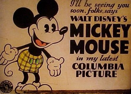
...editing and writing a variety of Disney, animation- and comic-related reference books, including Fantagraphics' Floyd Gottfredson Library. Look to our latest two-volume set (also available as individual books) for the complete run of Gottfredson's Mickey Mouse color Sunday comics, 1932-38—plus his later Sunday miscellany, including stray Mickeys and feature film adaptations.
      There's always a new project in the works... and a new blaze to extinguish! I'm reminded, again, of Bluto—and his slogan in a pre-Wicke Popeye cartoon, The Two-Alarm Fire (1934):

      Rare and tear and yell and shout
      If there's a fire round about
      Rare and tear and yell and shout
      Then Company C will put it out!

21 June 2012

Mouse, Interrupted


Once upon a time—way back in the 1930s—Columbia Pictures and United Artists released Walt Disney's Mickey Mouse cartoons to theatres. But Columbia and United Artists had nothing to do with the cartoons' non-theatrical distribution. So a few years later, when Disney prepared reissue versions for home and TV use, the original Columbia and United Artists main and end title sequences were replaced.

This led to the birth of the "burlap titles" shown here: so-called due to their cloth-like background texture. The burlap titles were printed on safety film stock and spliced into Disney's nitrate negatives. While appealing, they did have a certain sameness. All used the same logotype for Mickey's name, the same font for each cartoon's episode title, and the same musical notes tossing and turning behind.
The more unique original title sequences seemed to have vanished for parts unknown. Only occasional early release prints were known to preserve them; and in the 1990s, when the vintage Mickey cartoons were restored for laser, VHS, and DVD, only a few such early prints could be found at Disney.


Animation fans know what happened next. In an effort to return to the original style for home video, "faux" original titles were created to replace their burlap precursors. But while the results were a beautiful improvement, they couldn't quell my curiosity. As a contributing scholar when they were created, I still wanted to see the real originals.

Over the eight (in some cases, nineteen) years since the faux titles' creation, I've searched through private collections and film dealers' backstock in an effort to locate as many originals as I could. I even bought a few, despite my not usually collecting sound films. Over time, I've come across roughly two dozen title sequences, several of which I've shared here in the past. I've saved most, though, for this post: where, looking at them in sequence, we can gain a better understanding of how the title designs evolved.

We may even get a few surprises!

The Cactus Kid (1930) shows us how we'll look at most of these titles: with the originals on the left, and the recreations on the right


The first Columbia main title design featured thick white lettering on a dark gray background. Whereas earlier and later Mickey opening titles concluded with most of the card fading out, so only the episode title was seen (as in the recreation)—on the first Columbia shorts, the whole card faded out as one unit, title and all.
The first Columbia end title design cloned the 1928-29 Celebrity Pictures look, with goggle-eyed proto-Mickey and Minnie. Only the text under the figures has changed to indicate Columbia.

The recreated titles for Cactus Kid used later Columbia title cards as design templates. At the time, researchers (myself included) didn't know that the earlier Columbia cards looked any different; thus the understandable discrepancy.
A later Mickey headshot was also added to the start of the recreated Columbia titles; originally, the Columbia Mickey shorts had no headshot.

By the time of The Shindig (1930) things began to change. The better-known Columbia end title was now used, though I don't yet know whether The Shindig was the first cartoon to use it:


Pioneer Days (1930) is the earliest title where Disney itself has publicly released a newly-located original element. It didn't make the American DVD release in 2003, but for the disc's later issue in Europe, it was swapped in.
You'll notice that this time the episode title remains on-screen when most of the title card fades out. I don't know if Pioneer Days was the first Columbia Mickey to use this technique, but it's the earliest example I've thus far seen:


The Castaway (1931) was shown with original titles on the Disney Channel in the 1980s, but cropped tight so the Columbia references weren't visible. Here is the whole image (and its 1990s recreation, very close this time):


Unlike many of the elements I've accessed and studied, the original Delivery Boy (1931) was able to be viewed. Here are its main titles courtesy of my friend and colleague Tom Stathes (compare with the very close recreated version here):


Well into 1932, Columbia's Mickey title cards were still using primitive 1930 Mickey and Minnie character models. Interesting how they hadn't been supplanted with streamlined designs. Maybe a little too interesting... for gosh sakes, what's this?

In spring 1932, when United Artists was preparing to replace Columbia as Mickey distributor, this promo image appeared in a Kay Kamen trade catalog. Drawn unmistakably by Floyd Gottfredson's comics team, it appears to be an intended update of the Columbia title card design.
Nevertheless, I have seen no film elements that include it—Columbia or otherwise. Columbia kept their 1930 design to the bitter end, and then the first United Artists titles looked like this:


The recreated version this time comes from among the first recreations done. At that time, it was evidently preferred not to mention United Artists, thus the omission of their name.
The recreated title sequences for this and other United Artists cartoons tend to feature the episode title zooming toward us as the rest of the card fades away. Original United Artists Mickeys were famous for this technique—but as I've only recently learned, they didn't introduce it until 1933.
Mickey's Nightmare (1932) was the first Mickey cartoon to open with a Mickey headshot on its initial release. The subsequent Trader Mickey (1932) had it too:


The recreated versions here are based on 1974 reissue titles for seven United Artists-era black and white shorts (not including Trader Mickey). The 1974 end title matches the 1974 main title for design and character poses. Both are staged from further away than the original 1932 image—so that 1970s theatres could crop them on the top and bottom for widescreen.
The opening headshot stayed as-is. At this point, we see that it isn't meant to be Mickey's "real" head—but rather a kind of sparkler toy. The beams of light whirl around it wildly and seem to come from within, as well as from behind. And then Mickey's face... well... er, see for yourself!


Somewhere, "Exploding Mickey" sits on a therapist's couch alongside the Lumber-Jack Rabbit Warner Bros shield, asking their mutual shrink how they can apologize to the many kids they've scared.
The recreated titles for Whoopee Party use the original title lettering, though inserted in the new template for understandable reasons.

The Wayward Canary (1932) tries out an odd, wider-than-usual font in the original title box. Maybe the 1932 letterer had heard a few noisy birds too many—and was sad, glad, or a little mad. (I was a little mad, myself: no end title on the only original element I could find.)


By the time of Mickey's Pal Pluto (1933), "Exploding Mickey" was replaced with one of Mickey's most famous headshots, at first seen in the proportionally small size depicted below.
Pal Pluto is also the earliest short I know (though not necessarily the first) to have originally featured the episode title zooming toward us as the rest of the card fades away. This time the "zoom" is hand-drawn, with the text actually animated as it moves.
The headshot in the recreated version here, with its more contrast-y sunbeam background, also comes from the 1974 reissues.


Mickey's Mellerdrammer (1933) boasts a title sequence that epitomizes the "classic" look. It opens with a small-size Mickey headshot; its episode title trucks mechanically toward the camera as the rest of the title card fades away. In essence, this is how we remember all the United Artists Mickeys looking (compare with recreated version here):


But the Disney studio never rested on its laurels. Having reached this "classic" look, the Mickey title sequences kept right on evolving.
With Ye Olden Days (1933), Disney toyed with making the opening Mickey headshot significantly bigger than before. Its thick lines look a bit awkward at the larger size:


Perhaps an entirely new headshot was called for. The earlier "Exploding Mickey" was reinked and repainted without the dynamite action (or third-degree burns). The result was a stunning title card variant that has not been seen by scholars for nearly eighty years.


With this bright new face came other alterations. Instead of zooming toward the viewer, the episode title now fades up to a larger size. The end card boasts a new blurb about the films' recording system.
Puppy Love (1933) was not the first film to effect these changes, but it is the earliest one where I can show you footage in action, here from a silent print in my personal collection. (Update 9/16/13: Soundtrack comes from Mickey Mouse in Black and White DVD [2001], where the opening and ending music cues are not original, but I can't help that—yet!)


Yet the changes to the Mickey titles were still not over. The end of 1933 brought a much more radical transformation in which all of the title cards were completely redesigned!
This new look would persist through the final black and white shorts in 1935. Here we see Giantland (1933), the earliest cartoon I know to have reflected the overhaul:


It is "new news" to me and other scholars that the black and white shorts received this final title card revision. Thus, past recreated titles have carried on using the 1932 design, for understandable reasons. Here is a comparison of the original Two-Gun Mickey (1934; sorry, end card missing) with its recreated equivalent...


And finally Mickey's Service Station (1935). Who woulda thunk? Not me... just a few short years ago. It just proves that there's no limit to these discoveries.


It turns out that the final Mickey black and white opening title was pressed into service one more time later in the 1930s. Several years before the burlap titles, at least some of the early Mickeys got an earlier reissue for which this card became the generic opener. (If you're a film collector and remember these Mickey and Minnie figures, now we know where they started out.)


Speaking of Two-Gun Mickey, our favorite rodent's Wild West prowess is also visible this week in Mickey Mouse: High Noon at Inferno Gulch, the latest volume of Fantagraphics Books' Floyd Gottfredson Library. Locating rare film materials is fun and fascinating—but there is no dearer project to my heart than the Gottfredson Library (Facebook page here), a series I co-edit and that I've waited my whole life to enjoy.

A "true" blogpost on the Gottfredson Library, and on the fellow writers and scholars who have helped make it possible, will hopefully land on Ramapith in the not-too-distant future. For now, allow me to say that if you like the research that appears on this blog, you'll find a mess of it in High Noon at Inferno Gulch. Rare spin-offs; unproduced cartoon relics; ancient foreign comic book covers; and with them, 200+ pages of Floyd Gottfredson's Mickey at his two-fisted, personality-plus comics best.


That's the spirit.